Writing /
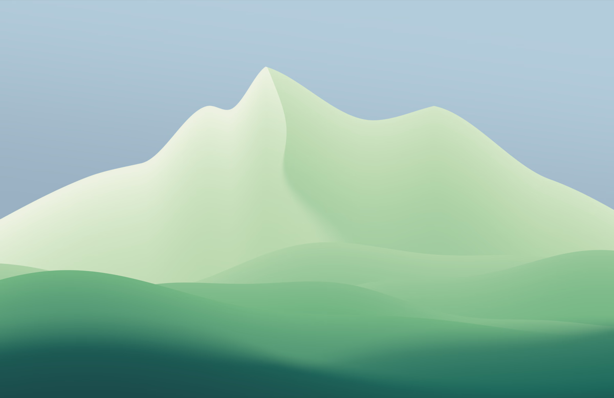
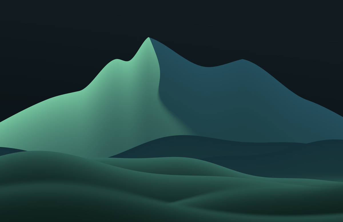
Summit, a tribute to Big Sur
4 min read
I’ve made Summit, a free wallpaper pack inspired by Apple’s macOS Big Sur wallpaper. It’s the first in a series of tributes to some Apple classics, if you can call them classics yet.
I saw Big Sur as a beach wallpaper. I wanted to try it from a different angle: the hills and mountains behind the coast.
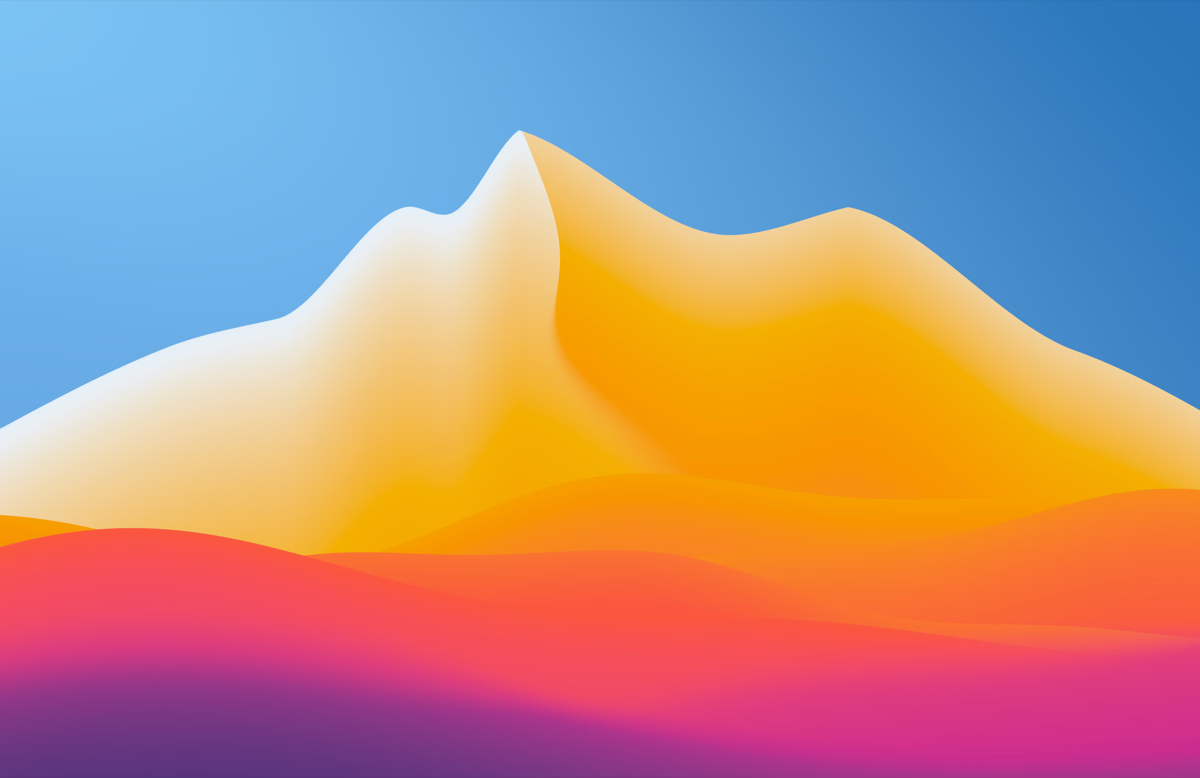
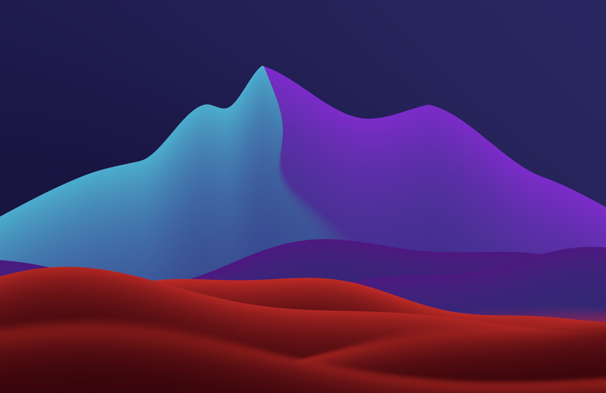
I’ve always been a big fan of the Big Sur wallpaper. I can remember when it came out alongside the macOS redesign, and it felt like something really fresh and new. I particularly like the vibrancy of the colours and how they fade between the different colours in the palette. I’ve tried to recreate that here.
I wanted to try different hills and shapes that still felt like Big Sur. The Santa Lucia Mountains run along the Big Sur coast, so I went with that.
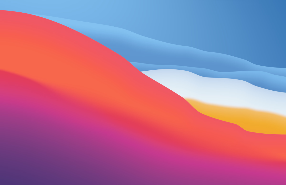
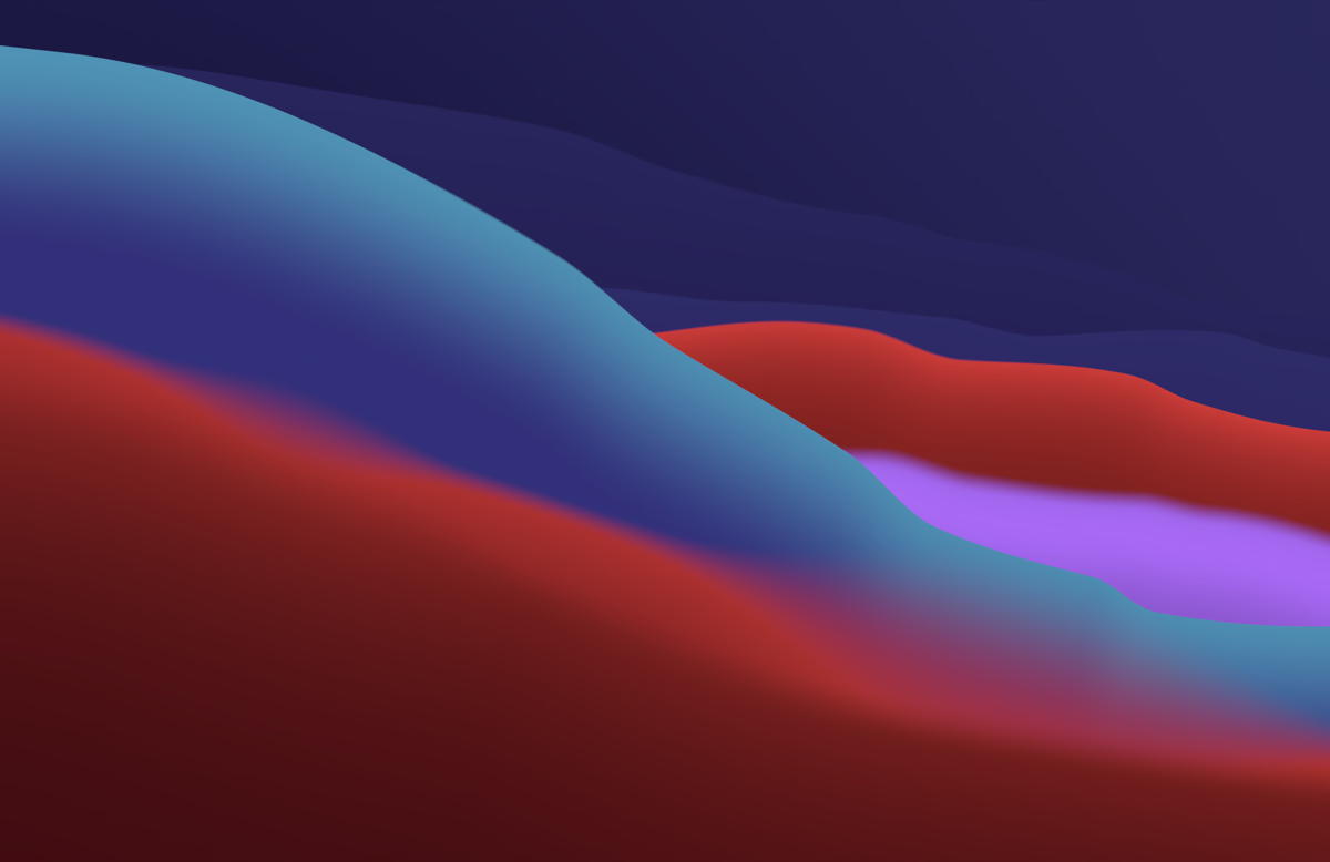
I’ve tried different wavy wallpapers over time. Drift has a similar vibe, but it’s more 3D. The second design, Hillside, is a recreation of Big Sur. I wanted broad, rounded hills. Even with the shading, I wanted it to feel very much like a drawing.
Just before release, it still didn’t feel like Big Sur: the waves were too consistent and the positioning didn’t feel right. The purple accent was too subtle, and only one wave was blurred. It took three rounds to get the perspective right, with a big, rounded hill at the front and smaller ridges close together behind it. I think it hits that Big Sur vibe.
There wasn’t much that bugged me about the original. I think it’s a really good wallpaper. But I didn’t always like the dark navy it started with at the bottom, so I’ve made it more subtle in both light and dark mode. The colour palette is slightly different, too.
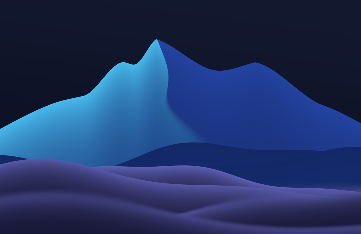
Apple’s version only comes in one colour palette, and I wanted to try a few others. Both designs come in three colourways: Apricot, Glacier and Juniper.
- Apricot
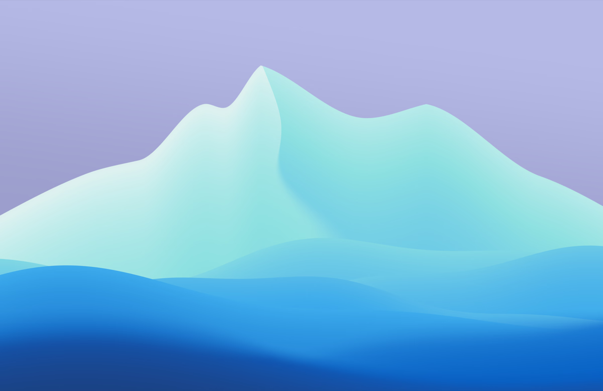
 Glacier
 Juniper
 Hillside Apricot
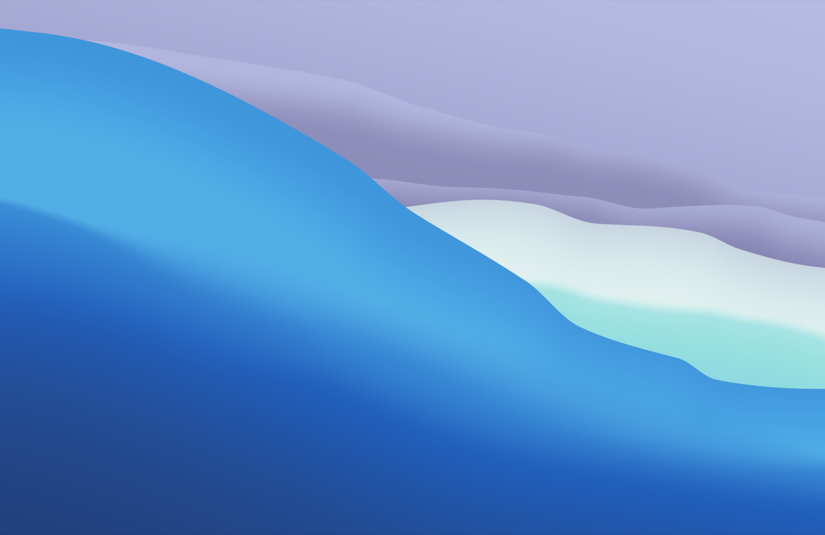
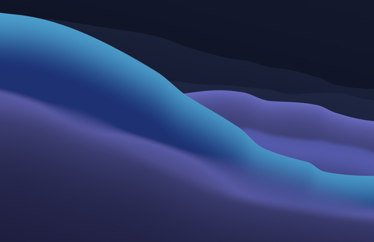 Hillside Glacier
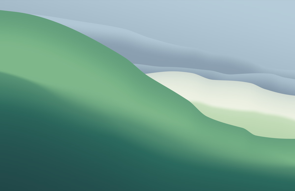
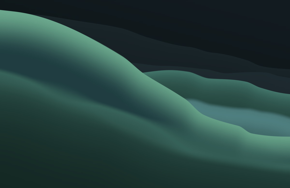 Hillside Juniper
Picking them was actually quite hard because I had that beach wallpaper in mind, so other colours felt a little off. Setting that aside, I think the colourways look good.
Glacier has a mix of light and dark blues. Juniper was meant to feel a bit like a field, with grassy colours.
I think Apple nailed it with the colour palette. Apricot is my favourite, maybe because of a bit of nostalgia for Big Sur. It’s the one I’m using at the moment.
I’ve kept closer to Apple’s colour palette in dark mode than I have in light mode. I had to tweak the wallpaper quite a bit and use different palettes. Each has its own dark mode, rather than a copy of the light palette with the lightness changed. Apricot was particularly tricky because Apple made that dark mode quite unique.
I’ve made desktop, tablet, phone and foldable versions of both designs in all three colourways.
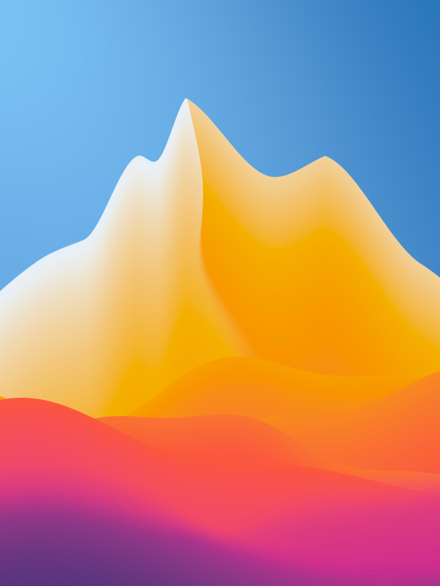
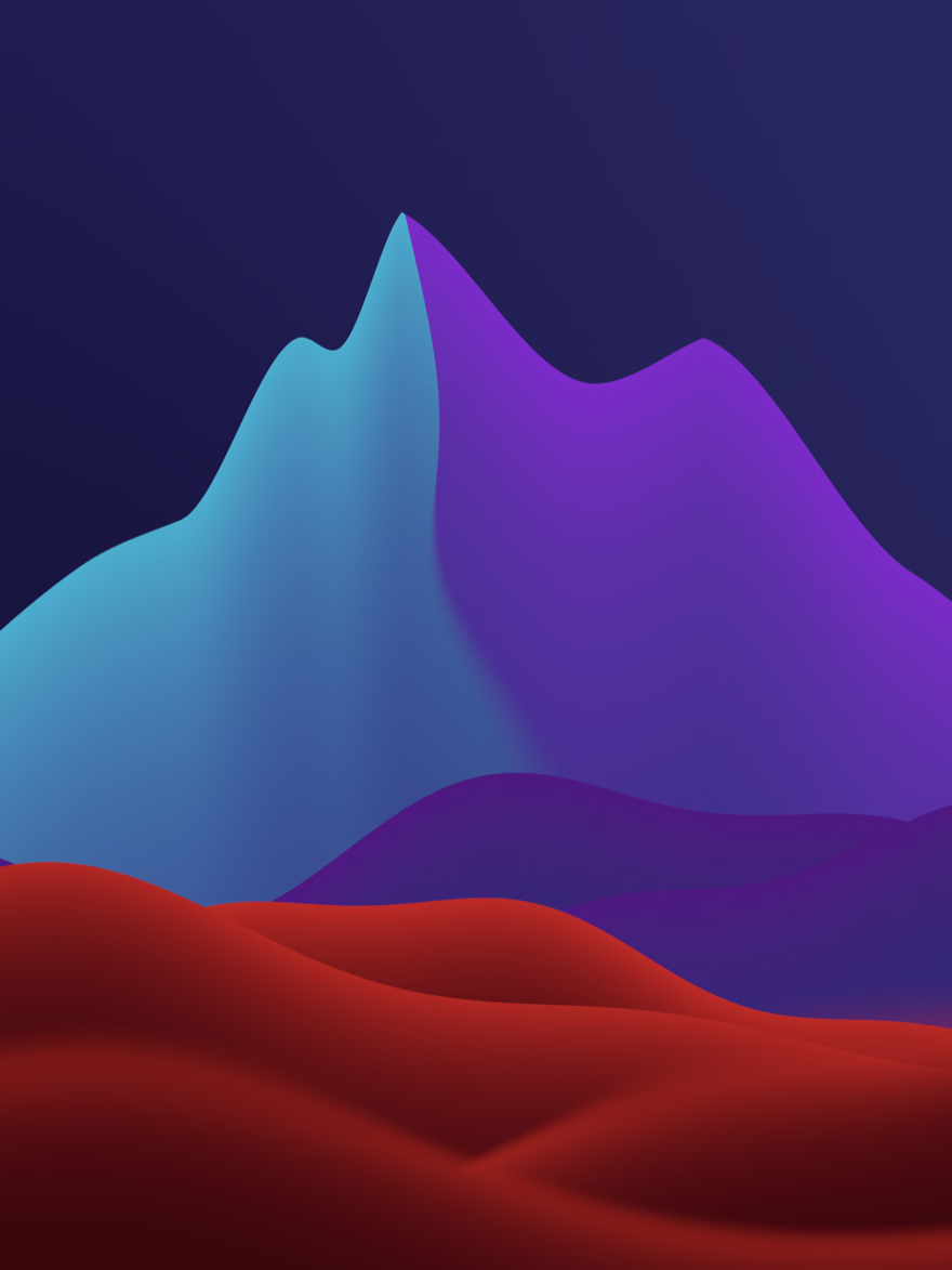
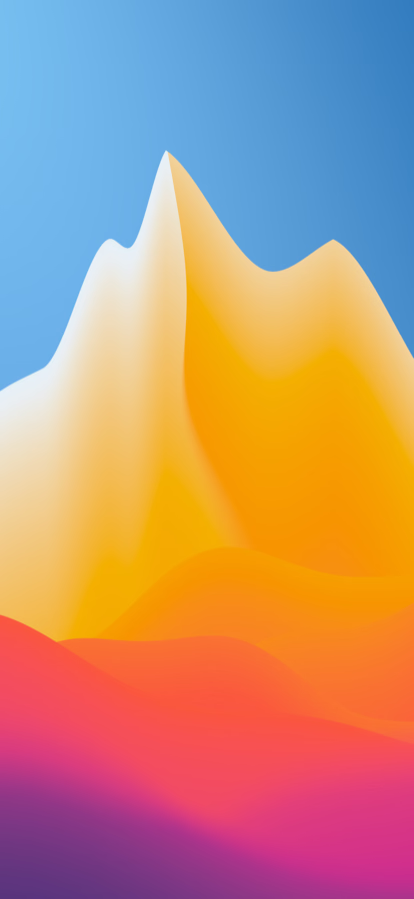
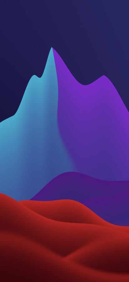
I like how Hillside looks behind Liquid Glass on the latest version of macOS. The vibrant colours work quite nicely with the translucency.
I actually started with Monterey, which I teased in Making wallpapers, then switched focus to Big Sur because I was enjoying it a bit more. I’m going to come back and finish it, and work on Ventura. I’ll likely put both up for free.